Anatomy of a Pyplot graph
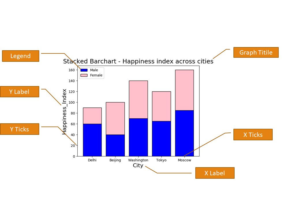
You can customize your pyplot graph by giving different notations as given below in the diagram. Matplotlib's Pyplot interface provides many functions, which you can use to provide legend, X Label, Y Label, X Limit, Y limit, graph Title and many more.

X & Y Labels for the plot
X Label and Y Label represents X-axis and Y-axis Names. You can use plt.xlabel and plt.ylabel for giving the names to X and Y axis respectively. Here plt is an alias for matplotlib.pyplot .
1 2 3 4 5 6 7 8 9 10 11 | import matplotlib.pyplot as plt x = [5,8,10] y = [12,16,6] plt.plot(x,y) plt.title('Epic Info') plt.ylabel('Y axis') plt.xlabel('X axis') plt.show() |
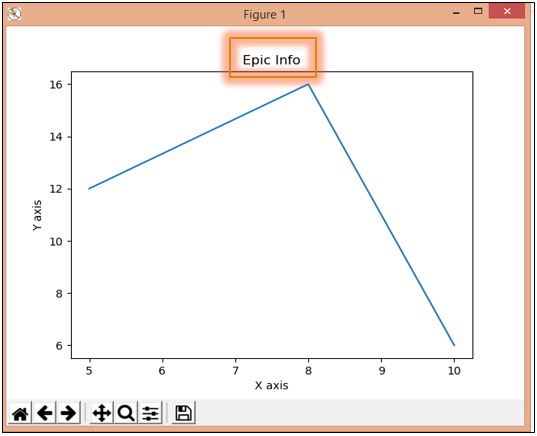
The above code will generate the following graph. In the above code, we have given name "X axis" and "Y axis" to X and Y axis respectively.
Title for the plot
The title provides the main heading to the graph. You can give Title using plt.title() function.
1 2 3 4 5 6 7 8 9 10 11 | import matplotlib.pyplot as plt x = [5,8,10] y = [12,16,6] plt.plot(x,y) plt.title('Epic Info') plt.ylabel('Y axis') plt.xlabel('X axis') plt.show() |
X & Y Limit for the plot
X-Limit and Y-Limit are used to provide the limit of numbers on X-axis and Y-axis. For this purpose xlim() and ylim() functions are used.
1 2 3 4 5 6 7 8 9 10 11 | import matplotlib.pyplot as plt x = [5,8,10] y = [12,16,6] plt.plot(x,y) plt.ylim(6, 16) plt.xlim(5, 10) plt.show() |
The above code is giving X-axis limit from 6 to 16 and Y-axis limit from 5 to 10. You can see the output of the above code below. In this graph X-axis numbers ranging from 5 to 10 and Y-axis numbers are ranging from 6 to 16.
X & Y Ticks for the plot
We can give the limits to X-axis and Y-axis using the above xlim and ylim function. But if we want to print only particular numbers on different axis we have to use xticks() and yticks() functions as shown below.
1 2 3 4 5 6 7 8 9 10 11 | import matplotlib.pyplot as plt x = [5,8,10] y = [12,16,6] plt.plot(x,y) plt.xticks([5,6,7,8,9,10]) plt.yticks([6,8,10,12,14,16]) plt.show() |
In the above code, I am providing the numbers in the form of a list in the functions xticks() and yticks(). So, you can see that in the below-given graph X-axis is showing ticks only for 5,6,7,8,9,10 and Y-axis is showing ticks only for 6,8,10,12,14,16.
Legend specify the use of different colours in our graph. As shown the graphgiven below Blue Color specifies the First Plot and Orange Color specifies the Second Plot.
<matplotlib.pyplot>.legend(loc="upper right")
values for loc:
"upper right" [Default]
"upper left"
"lower right"
"lower left"
Note: For legends you have to give label parameter in plot(), bar() or hist() functions.
Saving the plot
A plot can be saved in our computer permanently by using savefig() function. This function helps us to save our generated graph permanently in our computer.
<matplotlib.pyplot>.savefig(<string with filename and Path>)
Note:
- If only the file name is given, save the fig in the current directory.
- You can save figure in Popular Formats like (.pdf, .png, .eps etc)


No comments:
Post a Comment