
A line chart or Line graph is a type of chart which displays information as a series of data points called ‘markers’ connected by a straight line segment.
Pyplot has plot() function to create the Line Chart.
plot() Function Prototype:
<matplotlib.pyplot>.plot(X-Axis, Y-Axis, color, linewidth, linestyle or ls, marker, markersize, markeredgecolor)X-Axis, Y-Axis: Points on the X-Axis & Y-Axis in the form of Sequence
color: Color of Line. Should be valid color identified by Pyplot
linewidth: Width of the line in points (float value)
linestyle or ls: Style of the line (Ex:- Solid line, dashed line etc.)
marker: A symbol denoting the marker style such as ‘o’, ‘*’, ‘+’ etc.
markersize: Marker size in points (float value)
markeredgecolor: Color of the marker. Should be valid color identified by Pyplot.
Explanation of different Parameters:
(1) X-Axis, Y-Axis
These Parameters are used to provide points on the X-Axis & Y-Axis in the form of Sequence (i.e. list, tuple, numpy array etc.). In plot() function, only the Y-Axis point is a compulsory parameter. Other parameters are non-Compulsory, that means we can ignore all other parameters while creating line chart.
Note:- If we do not provide X-Axis points, by default it will be taken as [0,1,2,3,....]
Line Chart - With only Y-Axis Points
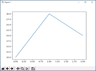
If we give only one list, it will take x-axis by-default [0,1,2,3,…..]
# importing Pyplot
from matplotlib import pyplot as plt

# Giving Y-Axis Points
plt.plot([10,30,20])

# Displaying the Plot
plt.show()
In the given chart you can see that the X-Axis parameters have been taken by default [0,1,2].
Line Chart - With X-Axis & Y-Axis Points
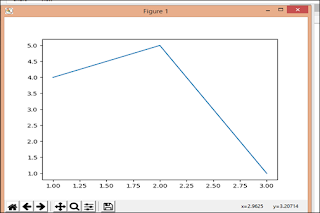
When we provide both X-Axis and Y-Axis Points, then pyplot take these points and prepare the line chart.
# Importing pyplot
from matplotlib import pyplot as plt

# Plotting to our canvas
# the graph will be generated for
# points ((1,4),(2,5),(3,1))
plt.plot([1,2,3],[4,5,1])

# Displaying what we plotted
plt.show()
Line Chart - Plotting Two or More Graphs on the same plot
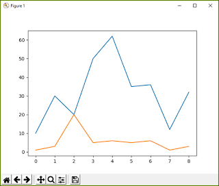
We can create Two or more than Two line charts on the same plot.from matplotlib import pyplot as plt
arr=[10,30,20,50,62,35,36,12,32]
arr1=[1,3,20,5,6,5,6,1,3]
plt.plot(arr)
plt.plot(arr1)
plt.show()
The output of the above code:
When we plot two charts we have to use two plot functions. The first function will create first line and then the second line will be create by the second plot function. By default, both will have different colors.
When we plot two charts we have to use two plot functions. The first function will create first line and then the second line will be create by the second plot function. By default, both will have different colors.
(2) color
| Character | Color | Character | Color | Character | Color | ||
|---|---|---|---|---|---|---|---|
| b | blue | m | magenta | c | cyan | ||
| g | green | y | yellow | w | white | ||
| r | red | k | black |
(3) linewidth
Width of the line in points (float value)(4) linestyle or ls
Style of the line (Ex:- Solid line, dashed line etc.)The value of linestyle or ls can be any of the following:
‘solid’ or ‘-’ [Default]
‘dashed’ or ‘--’
‘dashdot’ or ‘-.’
‘dotted’ or ‘:’
Line Chart - Changing Line Width, Line Color and Line Style
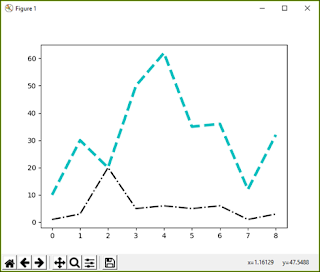
I have discussed color, linewidth and linestyle/ls. We can give the values as discussed above to change lone color, width or style.
from matplotlib import pyplot as plt
arr=[10,30,20,50,62,35,36,12,32]
arr1=[1,3,20,5,6,5,6,1,3]
plt.plot(arr,'c',linewidth=4,ls='dashed')
plt.plot(arr1,'k',linewidth=2,ls='dashdot')
plt.show()
(5) marker
A symbol denoting the marker style such as 'o', '*', '+' etc.| Character | description | character | description | character | description | ||
|---|---|---|---|---|---|---|---|
| '.' | point marker | '2' | tri_up marker | '+' | plus marker | ||
| ',' | pixel marker | '3' | tri_left marker | 'x' | x marker | ||
| 'o' | circle marker | '4' | tri_right marker | 'D' | diamond marker | ||
| 'v' | triangle_down marker | 's' | square marker | 'd' | thin_diamond marker | ||
| '^' | triangle_up marker | 'p' | pentagon marker | '|' | vline marker | ||
| '<' | triangle_left marker | '*' | star marker | '_' | hline marker | ||
| '>' | triangle_right marker | 'h' | hexagon1 marker | ||||
| '1' | tri_down marker | 'H' | hexagon2 marker |
(6) markersize
Marker size in points (float value)(7) markeredgecolor
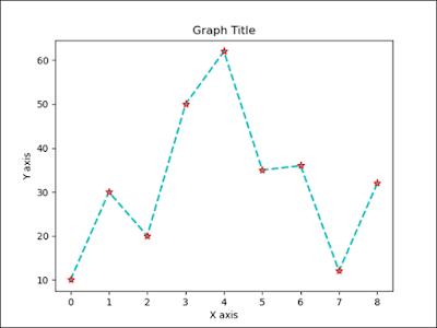
Color of the marker. Should be valid color identified by Pyplot.Line Char - Changing Marker Type, Marker Size and Marker Color
from matplotlib import pyplot as plt
arr=[10,30,20,50,62,35,36,12,32]
plt.plot(arr,
  marker='*',
  markersize=8,
  markeredgecolor='red')
plt.show()



No comments:
Post a Comment