Python is a very vast language, you can use it for many purposes. One of the best examples is Data Visualization. Under data visualization, you can develop many types of graphs. In this post, we will discuss Python Bar Chart.
Bar Chart in Python can be created using Pyplot interface of matplotlib Module. We will discuss matplotlib bar chart examples using programming.
A diagram in which the numerical values of variables are represented by the height or length of lines or rectangles is called Bar Graph or Bar Chart.
Python pandas is a very rich library for data analysis, we can analyse the data using Pandas and after that bar chart in Python, pandas can be created using pandas dataframe and series. According to CBSE Class 12 Informatics Practices I have covered all the topics related to Python Bar Chart.
Pyplot bar() function in Python
For the bar chart, we will use the bar() function, where we define the position of the bars on the X-axis and their height on the Y-axis. Additionally, we can also configure other characteristics for the chart, like the width of the bars, color, among others using the parameters of bar() Function. |
| Bar Chart |
bar( ) function Prototype
Follwoing is the prototype of bar function:
<matplotlib.pyplot>.bar(<X-Axis>, <Y-Axis>, width, color, align)
X-Axis: Points on X-Axis in the form of Sequence
Y-Axis (height): Height or Points on Y-Axis in the form of Sequence
color: Color of Bar. Should be valid color identified by Pyplot
width: Width of bars in the form of scalar value or as a sequence
align: {‘center’, ‘edge’}, optional, default ‘center’
Note: X-Axis and Y-Axis should have the same number of values and both the values are required.
Explanation of different Parameters of bar() function
Now we will discuss each parameter with some programming examples and we will learn how to create python bar chart code. After going through all the following parameters and examples you can easily create a bar chart using matplotlib in python.
(1) X-Axis, Y-Axis(height)
We have already discussed these parameters above, both of these parameters are compulsory. If we do not provide any of these parameters our program will give an error.
Bar Chart - With X-Axis and Y-Axis Points
import matplotlib.pyplot as plt;

# Variables for the bar chart
# Both X and Y arrays are required and both should be of same size
y_axis = [20,50,30]
x_axis = [0,1,2]

plt.bar(x_axis, y_axis)

plt.show()
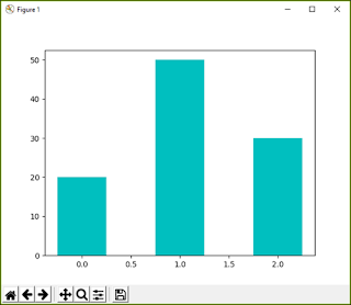
The above program is creating the simplest matplotlib bar chart in Python. Here I am passing y-axis and x-axis values in the form of a sequence. The output of the above code is available below, the bar chart is generating on x_axis points and taking the height from y_axis list.
 |
| Bar Chart - Creating First Bar Chart |
(2) color
This parameter decides the python bar chart color. color parameter is the most important parameter since by using this we can differentiate multiple bars in the graph. following are the values that can be used for matplotlib bar chart color.
| Character | Color | Character | Color | Character | Color | ||
|---|---|---|---|---|---|---|---|
| b | blue | m | magenta | c | cyan | ||
| g | green | y | yellow | w | white | ||
| r | red | k | black |
(3) width
By default, all the bars of any graphs will have the same width. We can change the width of the bars by providing any scalar value or using a sequence of value for each bar.
changing color and width with a scalar value
The below code shows how to change the width and color of all bars with a scalar value.
import matplotlib.pyplot as plt
arr1 = [1,2,3,4,5]
arr2 = [20,50,30,43,45]

# changing color and width with scalar value
plt.bar(arr1,arr2, width=0.5, color='k')

plt.show()
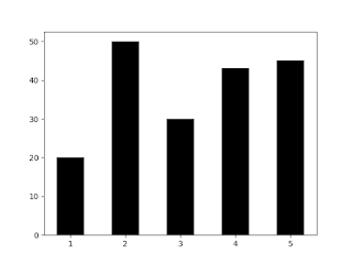
The above code is using a scalar value for the width and color parameter. This will make the width of all the bars as 0.5 and color to 'k' that means black. Following is the output for the above code:
To give a different width and color we have to use a sequence. The sequence must have the same values as the number of bars in our bar chart. After executing the above code we will get the following output:
 |
changing color and width with a scalar value
|
changing color and width with the sequence of values
The code shows how to give different width to different bars of a bar chart.
import matplotlib.pyplot as plt
arr1 = [1,2,3,4,5]
arr2 = [20,50,30,43,45]

# changing color and width with sequence of values
plt.bar(arr1,arr2,
width=[.5,2,1.5,1,0.5],
color=['m','c','k','b','r'])

plt.show()
To give a different width and color we have to use a sequence. The sequence must have the same values as the number of bars in our bar chart. After executing the above code we will get the following output:
 |
| changing color and width with a scalar value |
(4) align
This parameter is used for alignment of bars on X-Axis. This parameter can have two values 'center' and 'edge'. Let us now discuss each value:
at 'center'
This is the default value for align parameter.
import matplotlib.pyplot as plt;
y_axis = [20,50,30]
x_axis = [0,1,2]

plt.bar(x_axis, y_axis, align = 'center')

plt.show()
you can give align parameter inside bar() function. To understand the align parameter see the below figure. Different bars have been generated on different values which we have provided inside x_axis list. You can see that every point is in the middle or at the center of bars.
 |
| Align on 'center' |
at 'edge'
When we use align parameter value as 'edge', the bars will start from the edge of the x-axis points.
import matplotlib.pyplot as plt;
y_axis = [20,50,30]
x_axis = [0,1,2]


plt.bar(x_axis, y_axis, align = 'edge')

plt.show()
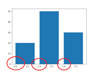
In the above code the value of align is 'edge', hence you can see the bars are starting from 0,1 and 2 respectively.
 |
| Align on 'edge' |
Horizontal Bar Chart in Python (barh() Function)
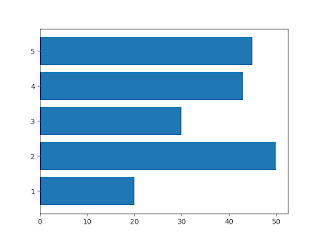
Python Horizontal Bar chart is a Bar chart that has its bar parallel with the X-Axis. It can be developed using barh() Function, which is available in pyplot interface of matplotlib library.
 |
| Horizontal Bart chart |
barh() Function Prototype
barh( <y_axis>, <x_axis>, height, color, align)
Y-Axis: Points on Y-Axis in the form of Sequence
X-Axis (width): height or Points on X-Axis in the form of Sequence
color: Color of Bar. Should be valid color identified by Pyplot
height: Width of bars in the form of scalar value or as a sequence
align: {‘center’, ‘edge’}, optional, default ‘center’
Note:- The difference between bar() and barh() is only the first two parameters. The places of X-Axis and Y-Axis has been interchanged. All the parameters work exactly in the same way.


No comments:
Post a Comment